Archive: April 2008
Graphabulous No. 1
April 7, 2008
I thought I'd start a new series: great graphs I've known. The first set is from a story about Tiger Woods in the sports section of today's New York Times.
The first graph is actually a table, but the NYT graphics people have tweaked the table in a way that gives the whole thing the visual impact of a graph.
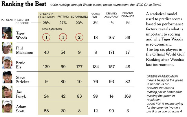
The point of the table is to show that Tiger Woods, different from the next top-five rated golfers, excels at the very aspects of golf that a statistical analysis determined are the key to success --getting on the green, putting, and "scrambling" (making par or better after missing the green in regulation); and, meanwhile, he actually doesn't do particularly well at aspects of the game that are less important, including driving distance, driving accuracy, and "going for it" (trying for the green in two on a par five or in one on a par four)-- things that are often the obsession of casual golfers.
So, why does this table work so well? First of all, the first three columns, which show the three most important aspects of the game, are set off using darker shading from the three (far) less important aspects in the last three columns. The first row, which includes a nice label "Percent Predictor of Score" with an arrow, determines the order of the columns, from the most important to the least important factor. The contrast in shading suggests the contrast in importance between the first three factors (28, 27, and 23 percent each of the overall predictive power) and the last three factors (3, 1, and 1 percent each of the overall predictive power).
Second, the three red circles draw attention to the three most important numbers in the table. Of the 200 golfers on the PGA Tour, Woods ranks 1st, 1st, and 2nd, in the three key components of the game. Going across the same row, it turns out that Woods is not particularly good at things that don't actually matter very much, including driving distance (ranked 38th) and driving accuracy (167th!). Moving down from the same red circles, the rest of the top-ranked golfers are all over the map when it comes to these three key skills.
The use of thumbnail photos of the golfers as part of the row labels is also a nice feature. The photographs add a Tuftean level of complexity to the table --and as much as any of the other features, help to turn the simple table into a graph. The photos instantly communicate information about age, race, and gender; and, for people who follow golf closely, the pictures may also trigger a wealth of associations concerning the golfers' playing styles and personalities.
Finally, the table includes a complete set of labels, definitions, and notes. Together, this explanatory text allows the table to tell almost the entire story detailed in the accompanying text. (Another of Tufte's principles.)
The same article also includes a series of graphs that show Woods's PGA rank (from 1 to 200) for several of the skills analyzed in the table above, in each year from 1996 through 2008. The first of these graphs shows Woods's driving accuracy over the past 12 years (right-hand portion of the figure):
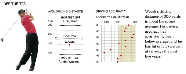
The y-axis shows the years from 1996 through 2008. The x-axis shows Woods's corresponding "driving accuracy" rank on the PGA tour, from 1 ("BEST") to 200 (worst on the tour). (As the note hints, "driving accuracy" is based on the percentage of drives that end up on the fairway; according to the note, over the last five years, Woods has only hit the fairway 57 percent of the time.)
The graph has some nice features. First, the two-tone shading divides the figure and the PGA tour into two equal groups, one above and one below the median. The shading makes it easy to grasp that Woods was at or below the median for driving accuracy in all but two of the last 12 years. Second, the placement of the diamonds on the continuum from 1 to 200 allows us to see the distance from the top (or bottom) in a way that would be less apparent if the data were presented as a simple connected line graph with rank on the y-axis and the year on the x-axis. (And note that a simple bar chart, another typical choice in this kind of situation, would be a bit confusing here because low ranks are "good" and high ranks are "bad".) Finally, the display makes it easy to see Woods's drift over time toward less (relative) accuracy.
Another great feature of this kind of graph is that it is easy to use to compare a golfer's relative performance across different aspects of the game. A subsequent figure in the same article summarizes Woods's putting performance (the second most important predictor of a golfer's score). The graphic in the lower right-hand corner below is constructed exactly as in the preceding graphic:
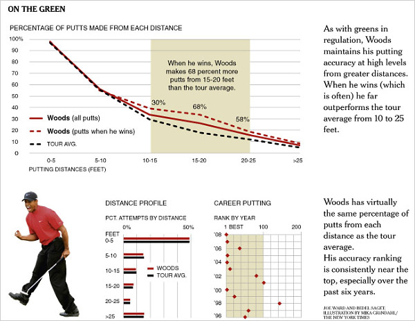
When it comes to putting, it is immediately obvious that Woods has been in the top half of the PGA for almost his entire career. It is also obvious that he has been at or near the very top in five of the last six years. The graph also allows for a quick and meaningful comparison of driving accuracy and putting performance, something that is not an obviously easy thing to do. Driving accuracy is measured as the percentage of tee-offs that land on the fairway, while putting performance is measured as the percentage of putts sunk. There is no reason that a golfer's percentage score in one category is in any way comparable to the golfer's percentage score in the other (think of trying to compare a baseball player's batting average to his or her fielding percentage). By ranking golfers within each category, however, the data become much easier to compare.
Woods is a much better putter, relative to his competitors, than he is a driver, again, relative to his competitors. And, we already know from the table above, that being relatively good at driving doesn't count for much when it comes to winning, while being relatively good at putting counts for a lot.